
Which Color?
Do you need to know the exact color in order to make your work more realistic?

How many times have you thought to yourself, “if only I had the right color” while working on a piece of art?
Many new artists think that having the exact right color in the exact spot will make their work realistic. However, is that true? Will having all the “right colors” in the “right places” make your art more realistic?
That’s what we’ll be discussing today.
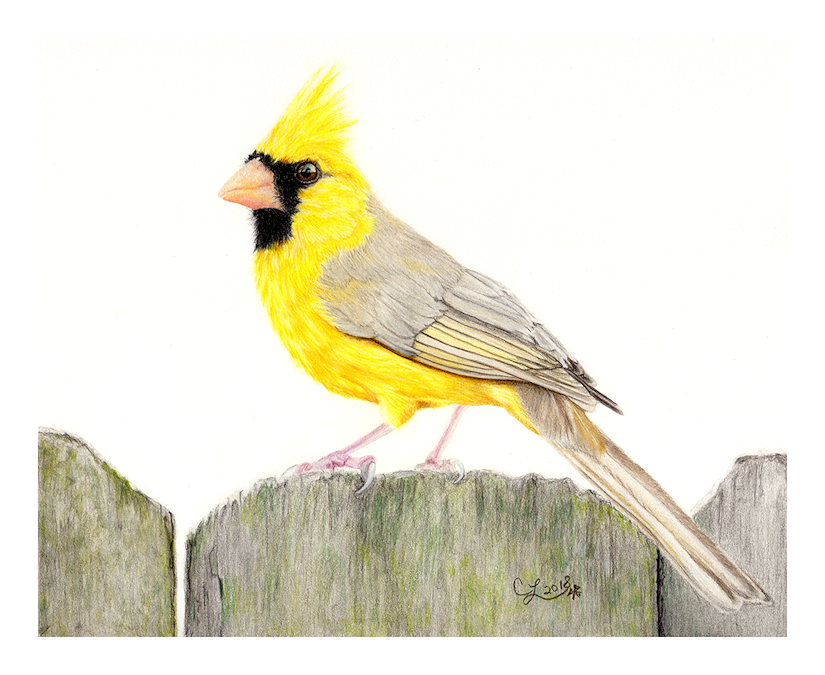
Sun Kissed Cardinal
8 x 10 inch Colored Pencil Painting of a rare Yellow morph Northern Cardinal in Alabama.
Based on a photo by Jeremy Black Photography.
For many years I shyed away from working in color. Why? Because I wondered if I’d be able to find the “right colors” to use in my artwork.
It wasn’t until I happened upon Lisa Clough’s YouTube Chanel, Lachri Fine Art, that I began to understand that realism had nothing to do with the actual colors! Realism is all about getting your line drawing accurate and using contrast!
In my supply list for colored pencils I have a subpage where I share my most used colors for various species. While it’s nice to know the general colors someone uses (especially as a beginner) it really isn’t a secret recipe for realism. If your contrast and initial drawing are weak, so will be your piece.
Colors can also vary due to lighting, reflections and many more factors. A portrait of a snow leopard in daytime will cause the fur to have warm tones. The same snow leopard at night will cause the fur to have cooler tones and wil depend on if there’s moon light.
My Example of Wrong Colors
Here is my piece, “Bee Unique.” It is a perfect example that you don’t need to use the exact colors in order to create a realistic piece.
My reference photo was a normal (pink) flamingo. Creating this piece I specifically set out with the goal of creating a realistic flamingo, but in the wrong colors. I wanted it to be a believable teal bird and you know what? It worked! I can’t begin to say how many times someone has asked me what kind of bird I drew? They believed it to be a real bird, in it’s natural color of feathers, but they had never seen one this color. It always makes me smile as it tells me I did a good job with my line drawing and contrast.

“Bee Unique”
Colored Pencil Piece
Conclusion
In conclusion, if you want your work to appear realistic work on your values. It will be the contrast in your values along with strong drawing skills that will make your work look real. If you’re having trouble seeing the contrast in your subject, try turning it to black and white. This will help the contrast in the values show up much easier. If you need to work on contrast and values one of the best ways is to work in graphite for a while. To create a realistic pencil drawing in graphite you heavily rely on values. It will help to hone your skills and those skills will then transfer to any other medium you choose to work in color!
Until next time, Keep Creating!
" Keep your lights light and your darks dark! "
Lisa Clough, Lachri Fine Art